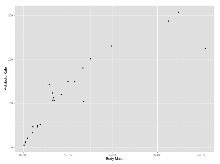
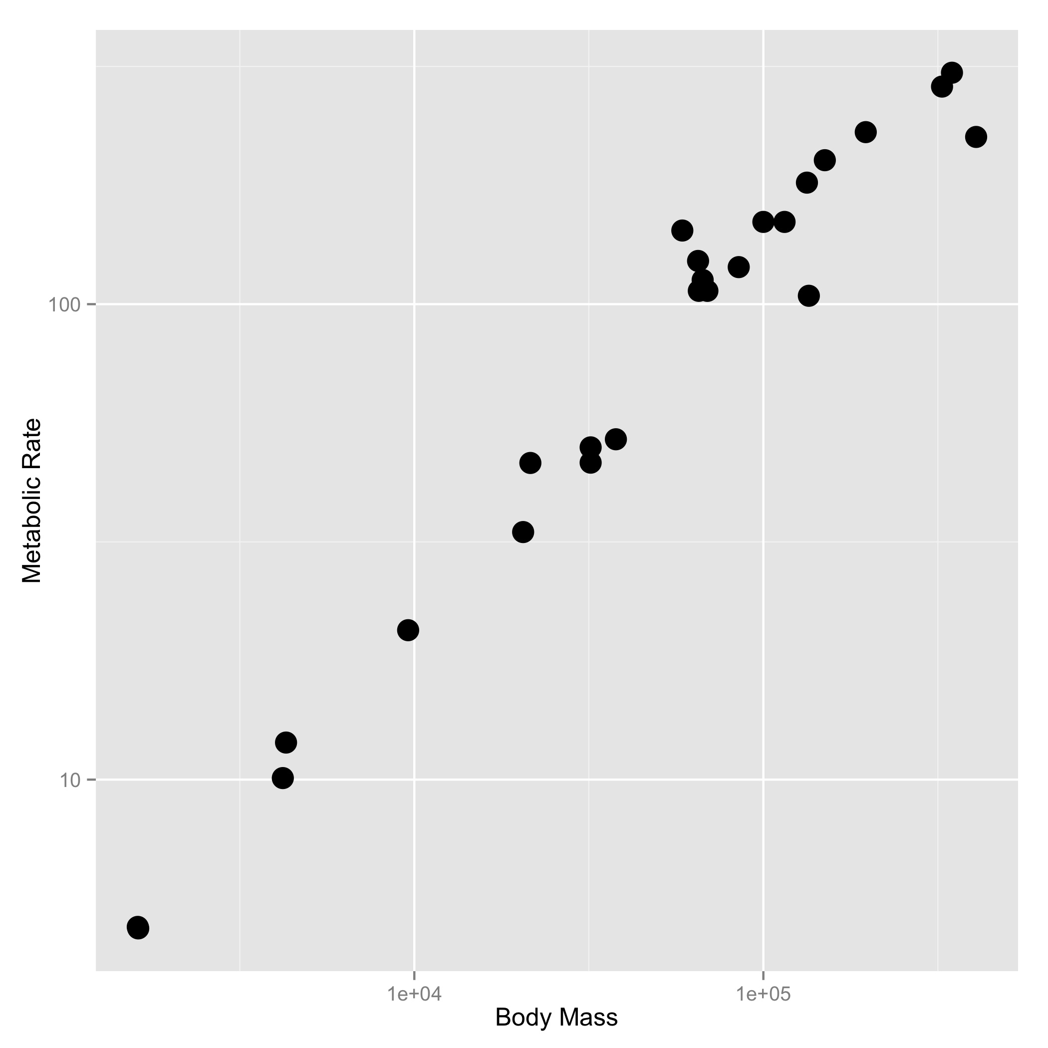
The relationship between the body size of an organism and its metabolic rate is one of the most well studied and still most controversial areas of organismal physiology. We want to graph this relationship in the Artiodactyla using a subset of data from a large compilation of body size data (Savage et al. 2004). You can copy and paste this data frame into your program:
size_mr_data <- data.frame(
  body_mass = c(32000, 37800, 347000, 4200, 196500, 100000, 4290,
    32000, 65000, 69125, 9600, 133300, 150000, 407000, 115000,
    67000,325000, 21500, 58588, 65320, 85000, 135000, 20500, 1613,
    1618),
  metabolic_rate = c(49.984, 51.981, 306.770, 10.075, 230.073,
    148.949, 11.966, 46.414, 123.287, 106.663, 20.619, 180.150,
    200.830, 224.779, 148.940, 112.430, 286.847, 46.347, 142.863,
    106.670, 119.660, 104.150, 33.165, 4.900, 4.865))
Now make two plots with appropriate axis labels:
Think about what the shape of these graphs tells you about the form of the relationship between mass and metabolic rate.
[click here for output] [click here for output]