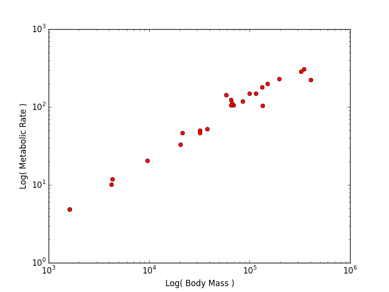
The relationship between the body size of an organism and its metabolic rate is one of the most well studied and still most controversial areas of organismal physiology. We want to graph this relationship in the Artiodactyla using a subset of data from a large compilation of body size data (Savage et al. 2004). You can copy and paste these two lists into your program:
body_mass = [32000, 37800, 347000, 4200, 196500, 100000, 4290,
32000, 65000, 69125, 9600, 133300, 150000, 407000, 115000, 67000,
325000, 21500, 58588, 65320, 85000, 135000, 20500, 1613, 1618]

metabolic_rate = [49.984, 51.981, 306.770, 10.075, 230.073,
148.949, 11.966, 46.414, 123.287, 106.663, 20.619, 180.150,
200.830, 224.779, 148.940, 112.430, 286.847, 46.347, 142.863,
106.670, 119.660, 104.150, 33.165, 4.900, 4.865]
Now make two plots with appropriate axis labels:
Think about what the shape of these graphs tells you about the form of the relationship between mass and metabolic rate.
Optional: If you like to make this a little more challenging (and see something
really cool), try getting the raw data and selecting just the Artiodactyla data
yourself. Unfortunately the raw data is trapped in a table that’s just part of
the article webpage. Fortunately, Pandas will automatically read the tables out of a webpage for us using its
read_html method. So, you can just run
data = pd.read_html("http://onlinelibrary.wiley.com/doi/10.1111/j.0269-8463.2004.00856.x/full")
and it will give us all of the tables from the web page, stored in a list. Pick the first table out of the list and you’ll be ready to get to work
NOTE: If you are using Enthought Canopy you will need a full Canopy
license. Academics can get this for free at
https://store.enthought.com/#canopy-academic. Then
use the package manager to add lxml.
