There were a relatively large number of extinctions of mammalian species roughly 10,000 years ago. To help understand why these extinctions happened scientists are interested in understanding whether there were differences in the body size of those species that went extinct and those that did not.
To address this question we can use the
largest dataset on mammalian body size in the world,
which has data on the mass of recently extinct mammals as well as extant mammals
(i.e., those that are still alive today). Take a look at the
metadata to
understand the structure of the data. One key thing to remember is that species
can occur on more than one continent, and if they do then they will occur more
than once in this dataset. Also let’s ignore species that went extinct in the
very recent past (designated by the word "historical" in the status
column).
Import the data into R. If you’ve looked at a lot of data you’ll realize that
this dataset is tab delimited. Use the argument sep = "\t" in read.csv() to
properly format the data. There is no header row, so use head = FALSE. The
unknown value used in the dataset is -999. R assumes your unknown value is
NA, but "NA" in the data is the code for North America. Use the additional
arguments stringsAsFactors = FALSE, na.strings = "-999" in read.csv() to get
R to keep "NA" as a string and transform -999 to NA.
It’s probably a good idea to add column names to help identify columns:
colnames(mammal_sizes) <- c("continent", "status", "order",
"family", "genus", "species", "log_mass", "combined_mass",
"reference")
dplyr would be one way to do
this). Export your results to a csv file where the first entry on each
line is the continent, the second entry is the average mass of the extant
species on that continent, and the third entry is the average mass of the
extinct species on that continent (spread() from tidyr is a handy way to
convert the standard dplyr output to this form). Call the file
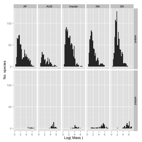
continent_mass_differences.csv.log_mass rather
than the mass itself so that you can see the form of the distributions more
clearly. facet_grid or facet_wrap may be useful to laying out the
subplots. Label the plots to make it clear to someone viewing them what they
are looking at. Save the graph or graphs as .png file(s) (this should
happen automatically in the code).