Based on overlap of genes across components wanted to increase sparsity be increasing lambda-gene values..
Ran with multiple values
LAMBDAS_GENE="0.00 0.01 0.05 0.1 0.2 0.4 0.8"
LAMBDA_SAMPLE=0.1
LAMBDA_TIME=0.05
RANK=35


OUTDIR_BASE=../output/26-rank35-optimization

for LG in $LAMBDAS_GENE; do
  OUTDIR=${OUTDIR_BASE}/lambda_gene_${LG}
  mkdir -p "$OUTDIR"

  /Users/sr320/.local/bin/uv run python ../scripts/14.1-barnacle/build_tensor_and_run.py \
    --input-file ../output/14-pca-orthologs/vst_counts_matrix.csv \
    --output-dir "$OUTDIR" \
    --rank $RANK \
    --lambda-gene $LG \
    --lambda-sample $LAMBDA_SAMPLE \
    --lambda-time $LAMBDA_TIME \
    --max-iter 2000 \
    --tol 1e-5 \
    --seed 81
done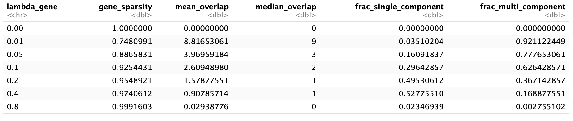
Move forward with lamda_gene of 0.2…
Sample

Time
library(tidyverse)

# File path
file_path <- "../output/26-rank35-optimization/lambda_gene_0.2/barnacle_factors/time_factors.csv"

# Read data
df <- read_csv(file_path)

# Compute variance of each component across timepoints
var_components <- df %>%
  pivot_longer(cols = starts_with("Component_"),
               names_to = "Component",
               values_to = "Value") %>%
  group_by(Component) %>%
  summarise(Variance = var(Value, na.rm = TRUE)) %>%
  arrange(desc(Variance))

# Select top 10 most variable components
top10_components <- var_components %>% slice_max(Variance, n = 10) %>% pull(Component)

# Prepare data for plotting
df_long <- df %>%
  pivot_longer(cols = starts_with("Component_"),
               names_to = "Component",
               values_to = "Value") %>%
  filter(Component %in% top10_components)

# Line plot
ggplot(df_long, aes(x = OG_ID, y = Value, group = Component, color = Component)) +
  geom_line(linewidth = 1.2) +
  geom_point(size = 2) +
  theme_minimal(base_size = 14) +
  theme(axis.text.x = element_text(angle = 45, hjust = 1)) +
  labs(
    title = "Top 10 Most Variable Components Across Timepoints",
    x = "Time Point",
    y = "Component Value"
  )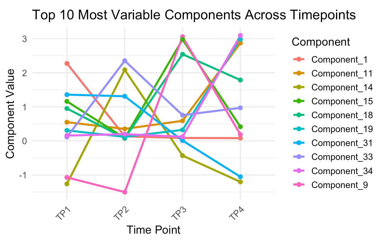
Pick your component
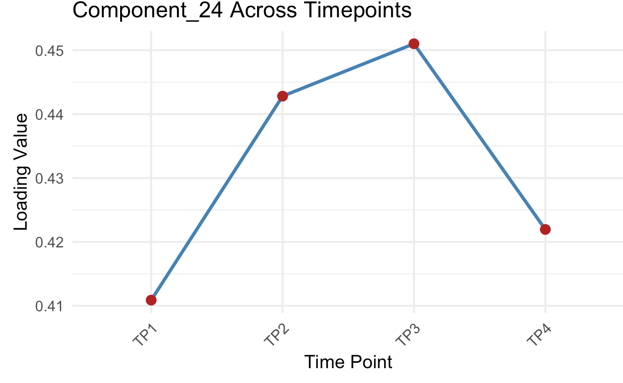
library(tidyverse)

# File path
file_path <- "../output/26-rank35-optimization/lambda_gene_0.2/barnacle_factors/time_factors.csv"

# ---- USER INPUT ----
# Pick the component you want to plot (e.g., "Component_5")
selected_component <- "Component_24"
# ---------------------

# Read data
df <- read_csv(file_path)

# Convert to long format
df_long <- df %>%
  pivot_longer(
    cols = starts_with("Component_"),
    names_to = "Component",
    values_to = "Value"
  )

# Check that the chosen component exists
if (!(selected_component %in% unique(df_long$Component))) {
  stop(paste("Component", selected_component, "not found in data!"))
}

# Filter for the selected component
df_sel <- df_long %>% filter(Component == selected_component)

# Plot single component across timepoints
ggplot(df_sel, aes(x = OG_ID, y = Value, group = 1)) +
  geom_line(linewidth = 1.2, color = "steelblue") +
  geom_point(size = 3, color = "firebrick") +
  theme_minimal(base_size = 14) +
  theme(axis.text.x = element_text(angle = 45, hjust = 1)) +
  labs(
    title = paste0(selected_component, " Across Timepoints"),
    x = "Time Point",
    y = "Loading Value"
  )
Gene Factor Loading

Annotation
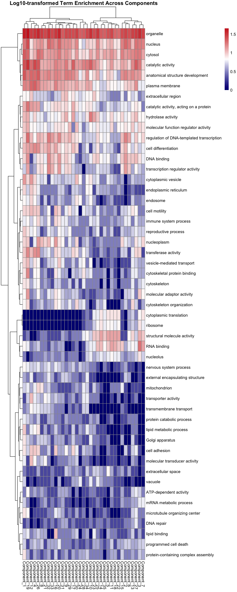
An Annotation - U pick!
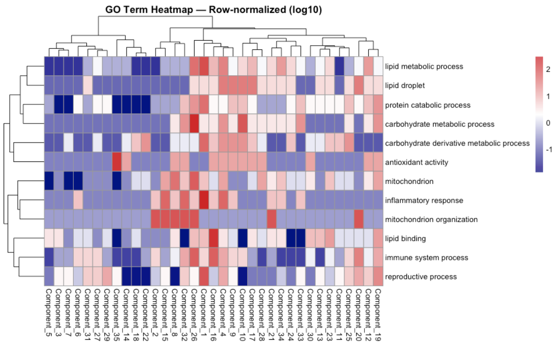
library(tidyverse)
library(pheatmap)

# ---- File path ----
file_path <- "../output/26-rank35-optimization/lambda_gene_0.2/top_genes_per_component/goslim_term_counts.csv"  # change to your actual CSV path

# ---- User input ----
# Enter one or more GO terms (exact or partial match)
selected_terms <- c("protein catabolic process", "lipid", "immune system process", "carbohydrate", "antioxidant activity", "mitochondrion", "inflammatory response", "reproductive")  # example

# ---- Options ----
row_normalize <- TRUE   # TRUE for row-normalized (z-score), FALSE for raw
log_transform <- TRUE   # TRUE to apply log10(x+1) before plotting

# ---- Load and prepare data ----
df <- read_csv(file_path)

# Remove total column if present
df <- df %>% select(-any_of("total"))

# Filter by GO term (partial match supported)
df_sel <- df %>%
  filter(if_any(term, ~ str_detect(.x, paste(selected_terms, collapse = "|"))))

if (nrow(df_sel) == 0) {
  stop("⚠️ No matching GO terms found. Check spelling or capitalization.")
}

# Convert to matrix
mat <- df_sel %>%
  column_to_rownames(var = "term") %>%
  as.matrix()

# Optional log-transform
if (log_transform) {
  mat <- log10(mat + 1)
}

# Optional row normalization
if (row_normalize) {
  mat <- t(scale(t(mat)))  # z-score per row
}

# ---- Plot heatmap ----
pheatmap(
  mat,
  scale = "none",
  color = colorRampPalette(c("navy", "white", "firebrick3"))(200),
  clustering_method = "ward.D2",
  show_rownames = TRUE,
  main = paste(
    "GO Term Heatmap —",
    if (row_normalize) "Row-normalized" else "Raw values",
    if (log_transform) "(log10)" else ""
  )
)