
Learning Objectives
Following this assignment students should be able to:
- understand the basic plot function of
ggplot2- import ‘messy’ data with missing values and extra lines
- execute and visualize a regression analysis
Reading
-
Topics
ggplot
-
Readings
Lecture Notes
Canvas Quiz
Exercises
-- Mass vs Metabolism --
The relationship between the body size of an organism and its metabolic rate is one of the most well studied and still most controversial areas of organismal physiology. We want to graph this relationship in the Artiodactyla using a subset of data from a large compilation of body size data (Savage et al. 2004). You can copy and paste this data frame into your program:
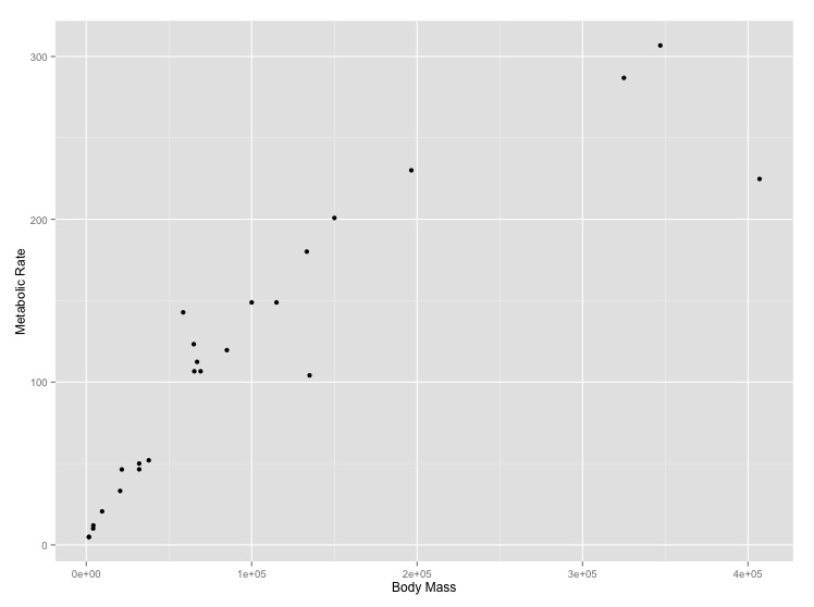
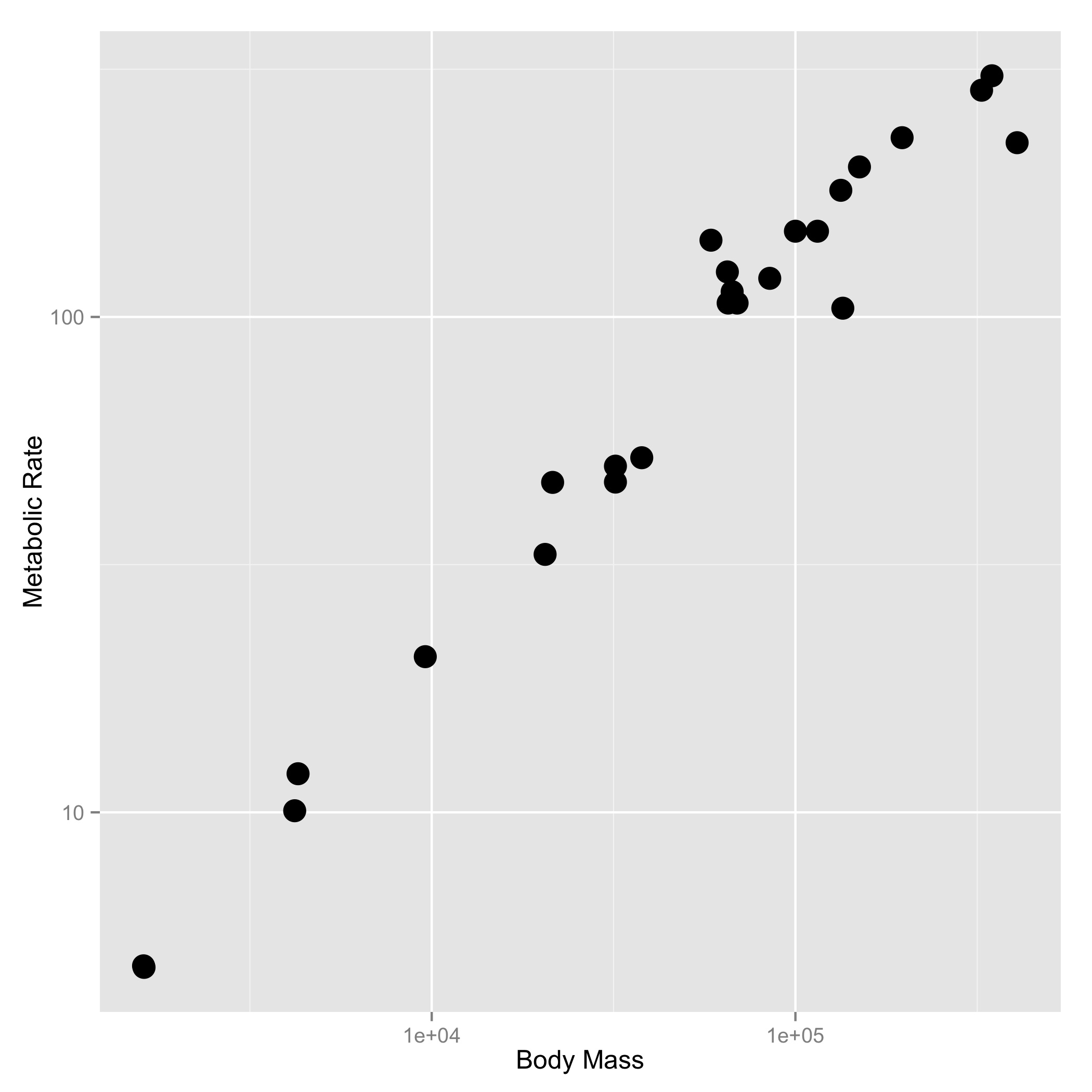
size_mr_data <- data.frame(
  body_mass = c(32000, 37800, 347000, 4200, 196500, 100000, 4290,
    32000, 65000, 69125, 9600, 133300, 150000, 407000, 115000,
    67000,325000, 21500, 58588, 65320, 85000, 135000, 20500, 1613,
    1618),
  metabolic_rate = c(49.984, 51.981, 306.770, 10.075, 230.073,
    148.949, 11.966, 46.414, 123.287, 106.663, 20.619, 180.150,
    200.830, 224.779, 148.940, 112.430, 286.847, 46.347, 142.863,
    106.670, 119.660, 104.150, 33.165, 4.900, 4.865))
Now make two plots with appropriate axis labels:
- A graph of body mass vs. metabolic rate
- A graph of body mass vs. metabolic rate, with logarithmically scaled axes (this stretches the axis, but keeps the numbers on the original scale), and the point size set to 5.
Think about what the shape of these graphs tells you about the form of the relationship between mass and metabolic rate.
[click here for output] [click here for output]-- Adult vs Newborn Size --
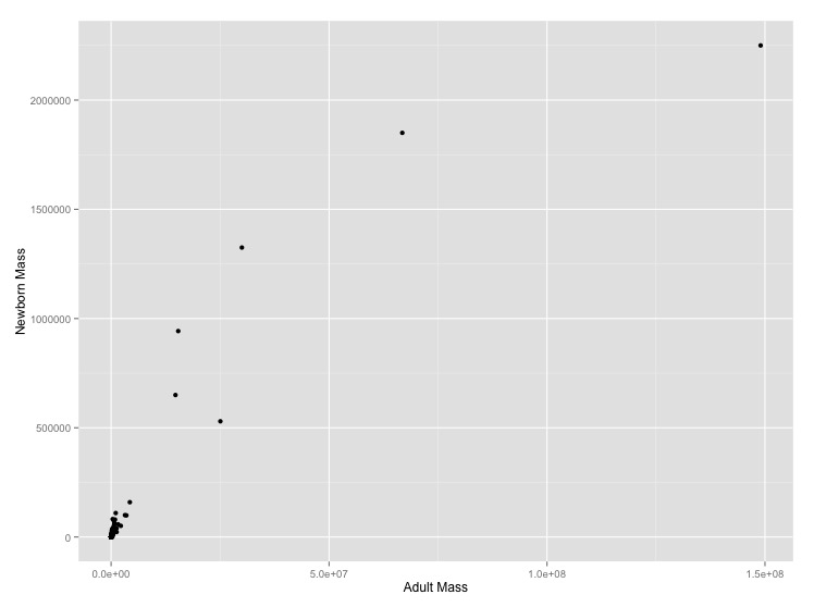
It makes sense that larger organisms have larger offspring, but what the mathematical form of this relationship should be is unclear. Let’s look at the problem empirically for mammals.
Download some mammal life history data from the web. You can do this either directly in the program using
read.csv()or download the file to your computer using your browser, save it in thedatasubdirectory, and import it from there. It is tab delimited so you’ll want to usesep = "\t"as an optional argument when callingread.csv(). The\tis how we indicate a tab character to R (and most other programming languages).When you import the data there are some extra blank lines at the end of this file. Get rid of them by using the optional
read.csv()argumentnrows = 1440to select the valid 1440 rows.Missing data in this file is specified by
-999and-999.00. Tell R that these are null values using the optionalread.csv()argument,na.strings = c("-999", "-999.00"). This will stop them from being plotted.- Graph adult mass vs. newborn mass. Label the axes with clearer labels than the column names.
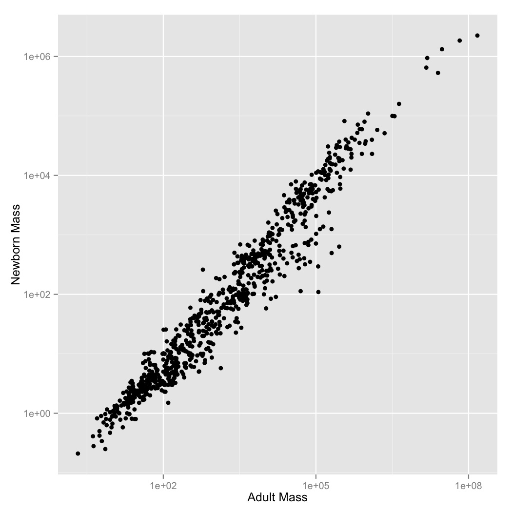
- It looks like there’s a regular pattern here, but it’s definitely not linear. Let’s see if log-transformation straightens it out. Graph adult mass vs. newborn mass, with both axes scaled logarithmically. Label the axes.
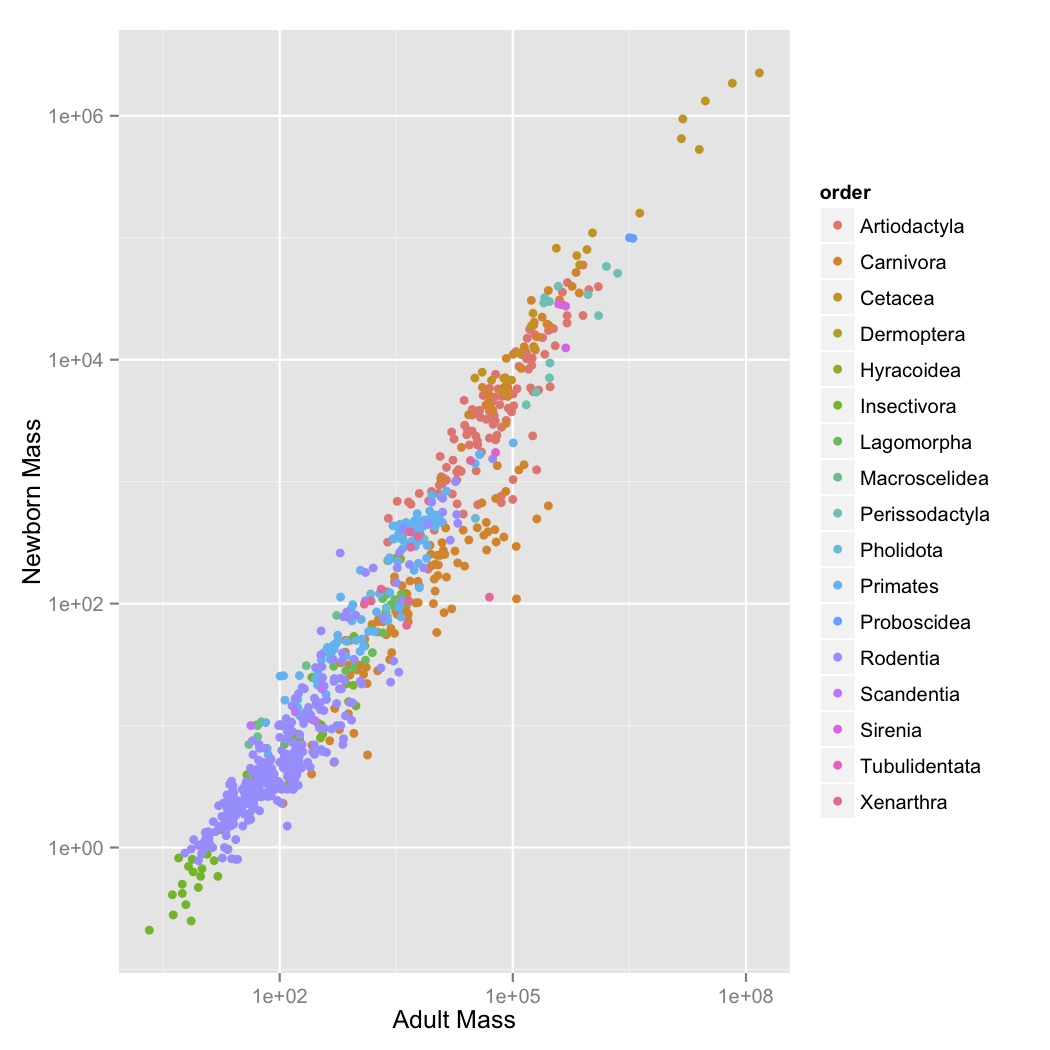
- This looks like a pretty regular pattern, so you wonder if it varies among different groups. Graph adult mass vs. newborn mass, with both axes scaled logarithmically, and the data points colored by order. Label the axes.
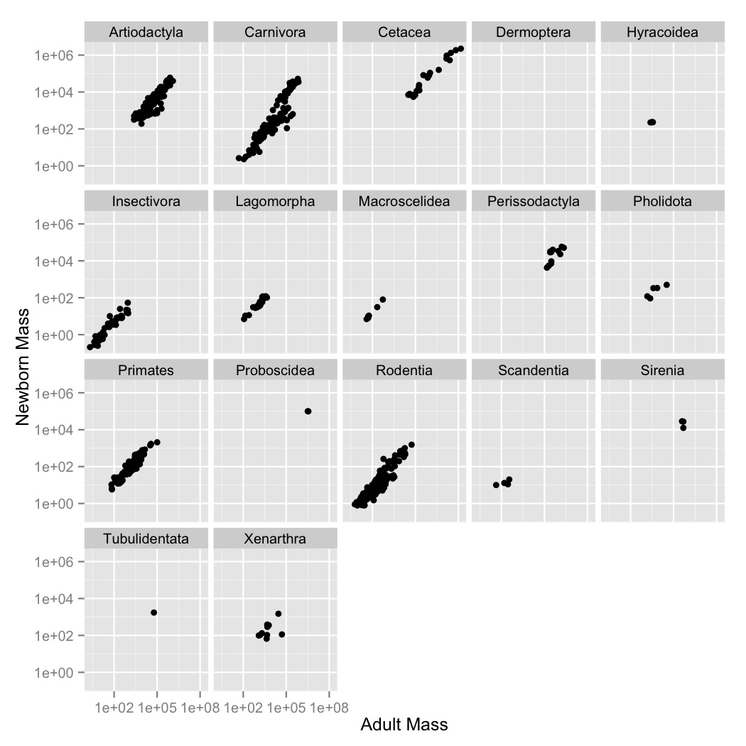
- Coloring the points was useful, but there are a lot of points and it’s kind
of hard to see what’s going on with all of the orders. Use
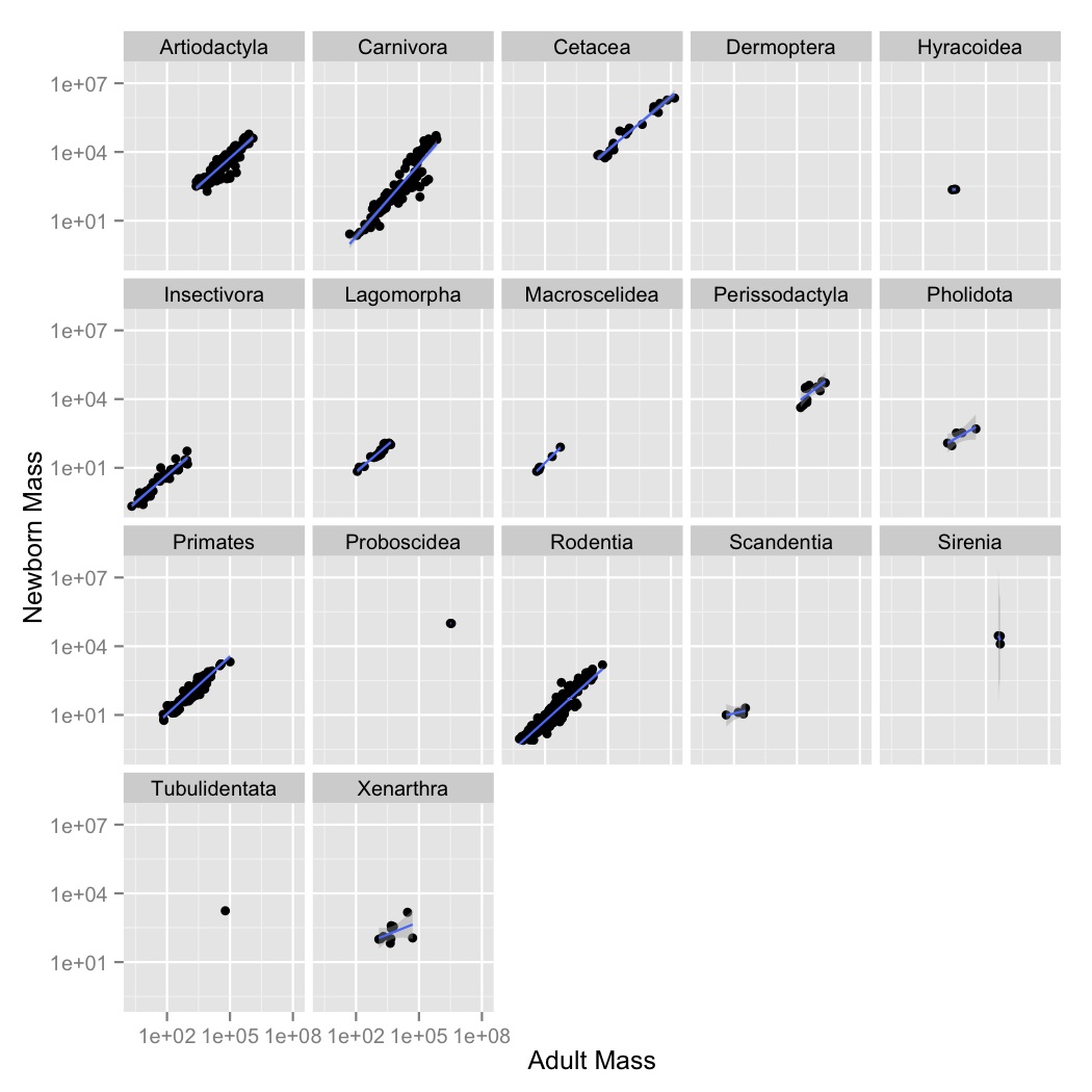
facet_wrapto create subplot for each order. - Now let’s visualize the relationships between the variables using a simple
linear model. Create a new graph like your faceted plot, but using
geom_smoothto fit a linear model to each order. You can do this using the optional argumentmethod = "lm"ingeom_smooth.
-- Sexual Dimorphism Exploration --
You are interested in understanding whether sexual size dimorphism is a general pattern in birds.
Download and import a large publicly available dataset of bird size measures created by Lislevand et al. 2007.
Import the data into R. It is tab delimited so you’ll want to use
sep = "\t"as an optional argument when callingread.csv(). The\tis how we indicate a tab character to R (and most other programming languages).Using
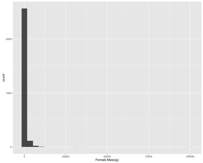
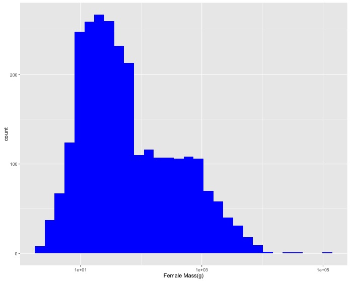
ggplot:- Create a histogram of female masses (they are in the
F_masscolumn). Change the x axis label to"Female Mass(g)". - A few really large masses dominate the histogram so create a
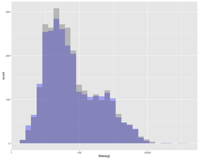
log10scaled version. Change the x axis label to"Female Mass(g)"and the color of the bars to blue (using thefill = "blue"argument). - Now let’s add the data for male birds as well. Create a single graph with
histograms of both female and male body mass. Due to the way the data is
structured you’ll need to add a 2nd
geom_histogram()layer that specifies a new aesthetic. To make it possible to see both sets of bars you’ll need to make them transparent with the optional argumentalpha = 0.3. - These distributions seem about the same, but this is all birds together so it
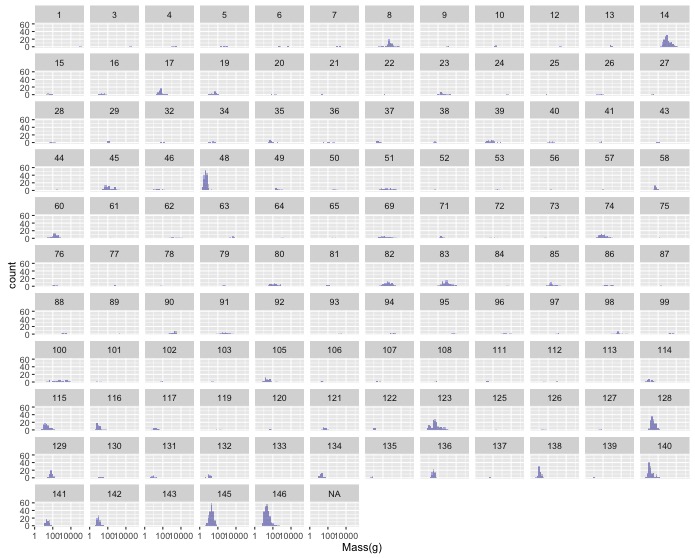
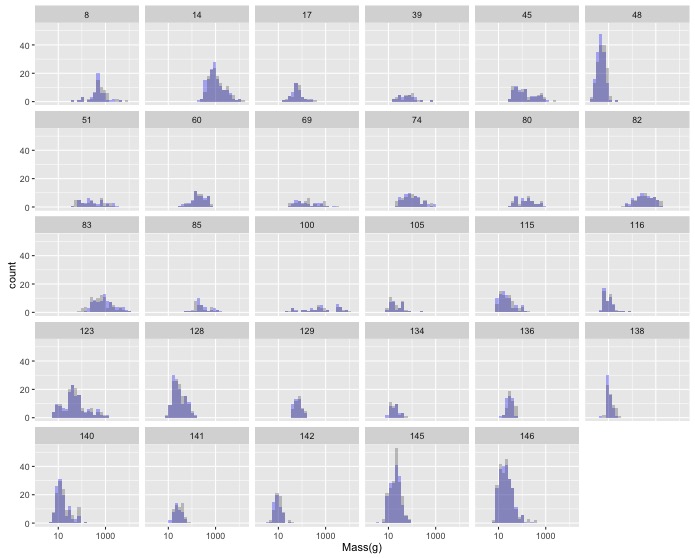
might be difficult to see any patterns. Use
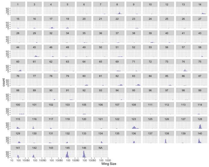
facet_wrap()to make one subplot for each family. - Make the same graph as in the last task, but for wing size instead of
mass. Do you notice anything strange? If so, you may have gotten caught by
the use of non-standard null values. If you already noticed and fixed this,
Nice Work! If not, you can use the optional
na.strings = c(“-999”, “-999.0”)argument inread.csv()to tell R what value(s) indicated nulls in a dataset.
- Create a histogram of female masses (they are in the
-- Sexual Dimorphism Data Manipulation --
This is a follow up to Sexual Dimorophism Exploration.
Having done some basic visualization of the Lislevand et al. 2007 dataset of bird size measures you realize that you’ll need to do some data manipulation to really get at the questions you want to answer.
-
In Sexual Dimorophism Exploration you created a plot of the histograms of female and male masses by family. This resulted in a lot of plots, but many of them had low sample sizes.
The following code creates a data frame with a column of Family IDs and a column of the number of species in the associated family that have non-null masses for both males and females.
 large_n_families <- data %>%
   filter(!is.na(M_mass), !is.na(F_mass)) %>%
   group_by(Family) %>%
   summarize(num_species = n())
Modify this code so that the resulting data frame only includes families with more than 25 species, and add a comment to the top of the block of code describing what it does.
Now join this with your original data to get the subset of your data with more than 25 species in each family.
inner_join()only keeps rows where the joining field(s) occur in both tables, so since you’ve already removed families without a lot of species fromlarge_n_families, they will be removed from the resulting data frame.Now, remake your original graph using only the data on families with greater than 25 species.
-
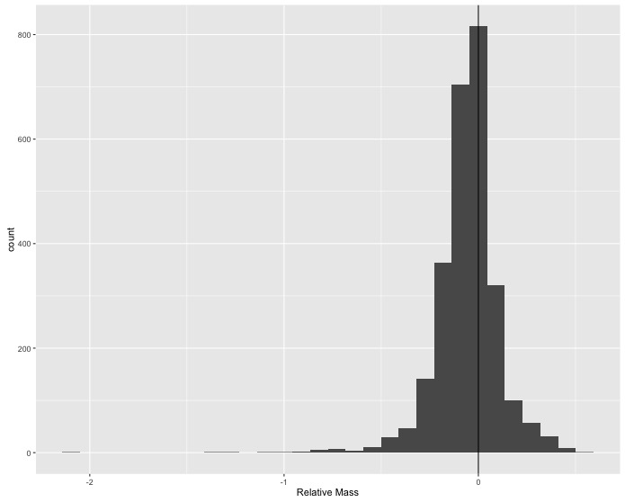
Sexual size dimorphism doesn’t seem to show up clearly when visually comparing the distributions of male and female masses across species. Maybe the differences among species are too large relative to the differences between sexes to see what is happening; so, you decide to calculate the difference between male and female masses for each species and look at the distribution of those values for all species in the data.
In the original data frame, use
mutate()to create a new column which is the relative size difference between female and male masses(F_mass - M_mass) / F_massand then make a single histogram that shows all of the species-level differences. Add a vertical line at 0 difference for reference.
-
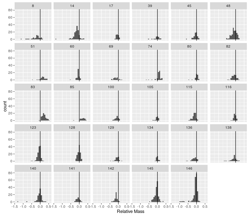
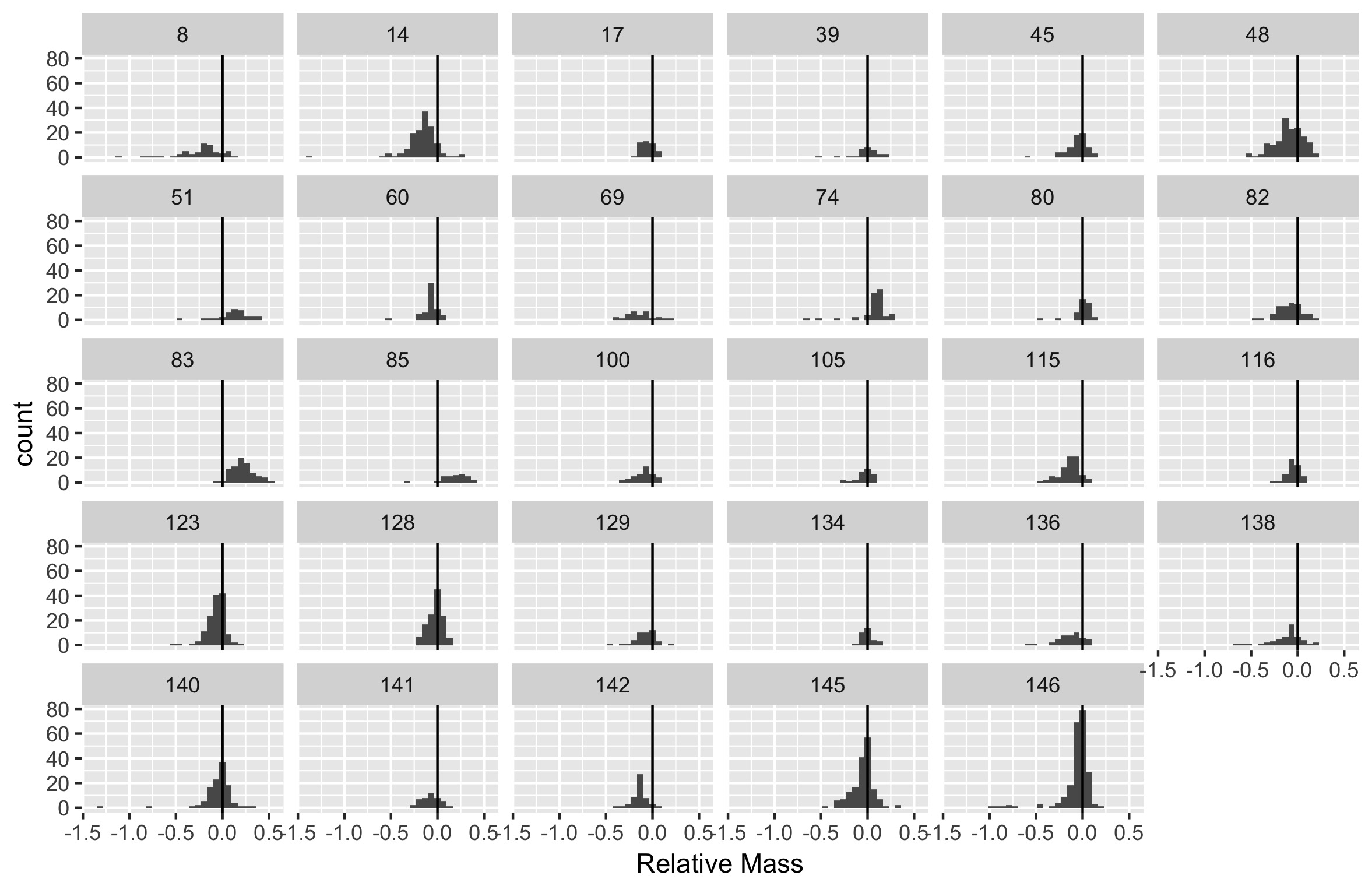
Combine the two other tasks to produce histograms of the relative size difference for each family, only including families with more than 25 species.
-
Save the figure from task 3 as a jpg file with the name
sexual_dimorphism_histogram.jpg.
-